 Brixel Proyect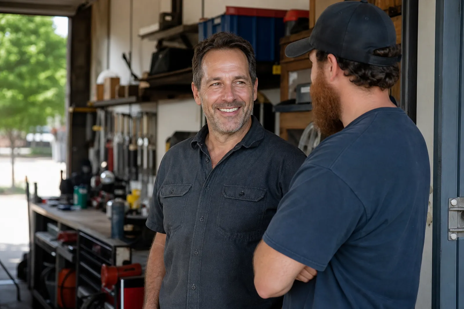
Start with one clear sentence about what you do
Your first screen should answer a basic question right away: what kind of business is this? A person should not have to guess from a clever slogan, a pretty photo, or a vague line like “quality service you can trust.”
Use plain words. If you are a locksmith, say locksmith. If you run a salon, say salon. If you fix air conditioners, say that. You can be friendly, but the first line should sound like a real person explaining the business to a neighbor.
- Good: “Emergency locksmith for homes and cars in Miami.”
- Good: “Family hair salon in Little Havana.”
- Avoid: “Solutions for every need.”
- Avoid: “We bring excellence to every project.”
Say where you work without making people hunt for it
A local visitor wants to know if you serve their area before they keep reading. Put your main service area in the first screen, and keep it honest. If you work across a city, name the city. If you only cover a few nearby neighborhoods, say that.
Do not bury your location in the footer or leave it for the contact page. A person on a phone may never get that far. The first screen can include the city name in the headline, subheading, or a short line under your main message.
- Use the city or neighborhood people actually search for.
- If you serve a wider area, say that only if it is true.
- Keep the wording short and easy to scan.
Give one clear path to contact you
The first screen should not make visitors guess how to reach you. Put your main action where it is easy to spot. For many service businesses, that means a call button or a contact button. If text works well for your business, you can include that too, but do not crowd the screen with too many choices.
The point is not to show every way to contact you. The point is to make the next step obvious. A visitor who is ready to act should not have to search for the phone number, dig through menus, or wonder which button matters.
- Choose one main action.
- Use plain button text like “Call now” or “Get help today.”
- Keep the button visible without scrolling.
Use one image that matches the real work
A strong first screen is not just words. The photo or image should match your business so the page feels real right away. Show your team, your van, your shop, a treatment room, or the kind of work you do every day.
Avoid generic stock photos that could belong to any business. Visitors know the difference. A real image builds trust faster because it shows the place, the people, and the type of service they can expect.
- Choose a photo that looks like your real job site or workspace.
- Use a clean, bright image with no clutter.
- Avoid photos that feel staged or unrelated.
Keep the message short enough to read in one glance
The first screen should work fast. Think of it as a front desk greeting, not a full sales page. One headline, one short line, one main button, and a useful image are often enough.
When the first screen tries to say too much, nothing stands out. Long paragraphs, extra offers, and stacked messages can make the page feel messy. Save details for the sections below. The first screen only needs to tell people they are in the right place and show them what to do next.
- Keep the headline short.
- Use one short supporting line.
- Do not list every service above the fold.
- Leave room so the screen does not feel crowded.
Make the top of the page work for real visitors, not just for design
A pretty homepage is nice. A useful homepage gets to the point. Many visitors arrive with a simple task in mind: find a service, check that you serve their area, and decide if you are worth calling. Your first screen should help them do that without thinking too hard.
It helps to look at the page as a first-time visitor would. Can they tell what you do in a second or two? Can they see where you work? Can they find the next step without scrolling? If the answer is no, the first screen needs a cleanup.
- Ask someone outside your business to read the top of the page.
- If they cannot explain your business back to you, simplify it.
- Remove anything that pulls attention away from the main action.
What can wait until below the fold
Not everything belongs in the first screen. Long service lists, detailed pricing, full company history, reviews, FAQs, and photo galleries can all live lower on the page. Those pieces still matter, but they do not need to compete with the main message.
Think of the homepage like a conversation. The first screen says who you are, where you work, and how to reach you. The rest of the page explains why someone should trust you, what you offer, and how the process works. When you separate those jobs, the page feels easier to use.
- Put details where people expect to find them later on the page.
- Use the first screen to guide attention, not to explain everything.
- If something does not help someone decide what to do next, move it down.
Questions owners ask
How much should fit on the first screen?
Usually just the core message, location, one contact action, and a relevant image. If the top feels busy, trim it until the visitor can understand it fast without scanning.
Should I put a long list of services at the top?
No. Pick the main service or the clearest group of services and put the rest lower on the page. A long list can hide the main message and make the page harder to read.
What if my business serves several nearby cities?
Name the main area you want to be known for, then mention nearby cities later on the page or in a service area section. The first screen should stay simple and local, not turn into a map.