 Brixel Proyect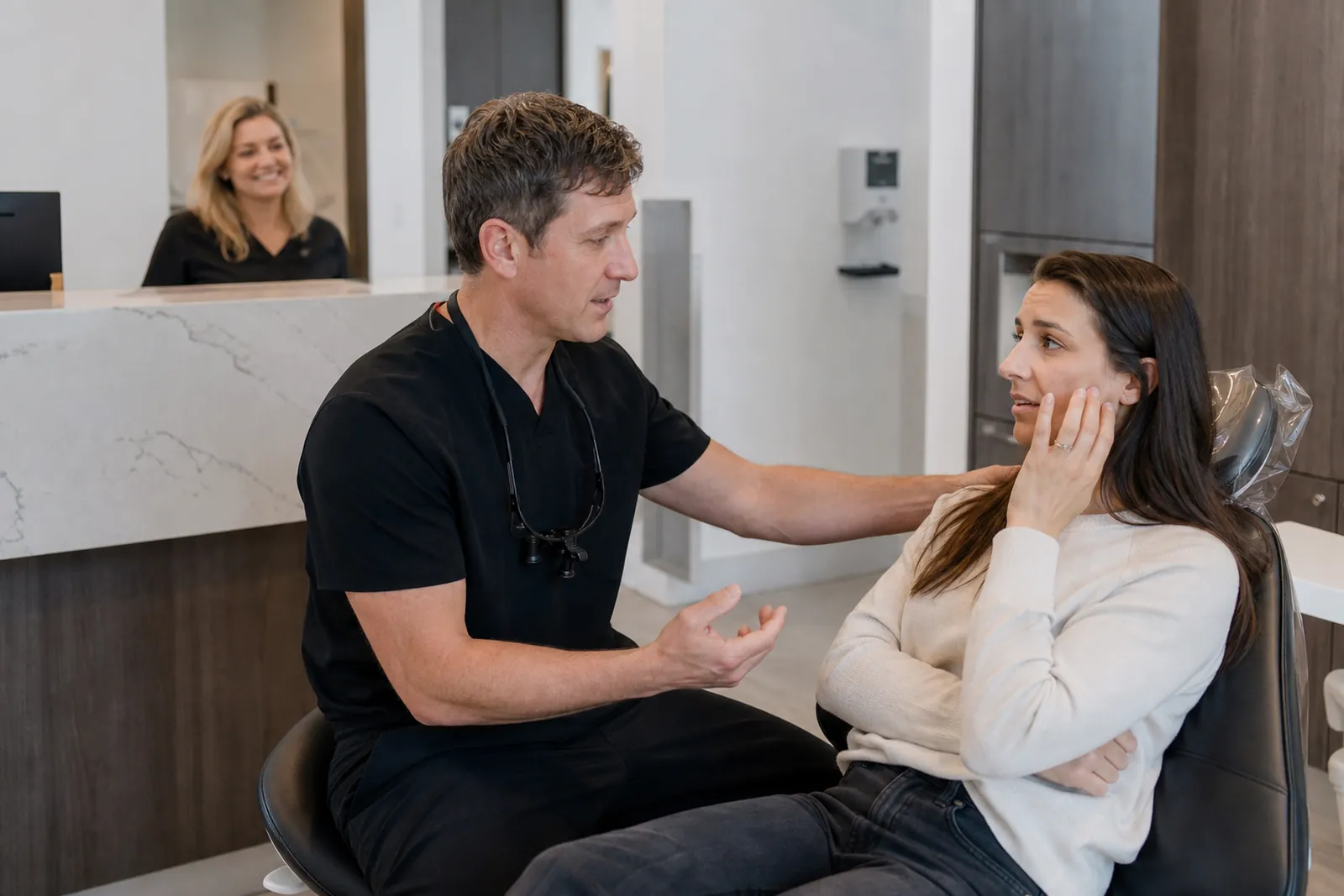
Start with the questions new patients ask first
Most people do not come to a dental site looking for design ideas. They want to know if your office takes their insurance, if you accept new patients, what to do if they are in pain, and how fast they can get help. Put those answers near the top of the home page and give each one its own page when needed.
Write like a person at the front desk would speak. Use short sentences. Avoid dental jargon when a plain word works better. If you say a word that patients may not know, explain it right away. A visitor should not have to guess what a cleaning, exam, extraction, crown, or root canal means in your office.
Your home page should point people to the next step fast. A nervous parent, a person with tooth pain, and a returning patient all need different paths. Give them clear buttons such as new patients, emergency visits, insurance, and book now.
- Put new patient, insurance, and emergency links near the top of the page.
- Use plain language first and dental terms second.
- Keep one clear path for each common reason someone visits.
Build a new-patient page that lowers fear
A new-patient page should feel like a calm handoff, not a form dump. Tell people what happens at the first visit, how long they should plan to be there, what to bring, and who they will meet. Explain the flow in simple order, from check-in to exam to any next steps.
Many nervous patients want to know what the office feels like. Say what your team does to help people relax. That could be a friendly welcome, a quiet waiting area, clear explanations before each step, or time to ask questions before treatment starts. Be specific. A vague line like "we care about comfort" does not help much on its own.
Use photos on this page that show real people from your office. A smiling front desk team, a dentist talking with a patient, and a clean treatment room tell a stronger story than stock photos. Keep the images honest and current. If you changed chairs, updated the office, or added team members, show the real space as it is now.
- Explain the first visit in the order it happens.
- Show the actual office and team, not generic stock images.
- Write one section just for patient comfort and questions.
Answer insurance questions before they turn into phone calls
Insurance confusion can stop a booking before it starts. Make an insurance page that tells people which plans you accept, what you can help verify, and what a patient should check with their provider. If you do not take certain plans, say that clearly and politely.
Do not hide insurance details behind a form. Give a plain summary on the page and add a simple note about how benefits can differ from one plan to another. That keeps expectations honest and helps your front desk avoid repeat calls with the same basic questions.
If you offer payment options, explain them in simple terms without turning the page into a finance brochure. The goal is not to cover every possible case. The goal is to help someone know if your office is a fit before they call.
- List accepted plans in plain language.
- Say what your staff can help check and what the patient should confirm.
- Keep the tone calm and direct, not legal or sales-heavy.
Make emergency visits easy to find and easy to act on
Emergency tooth pain is one of the few times a visitor is not browsing. They are trying to act fast. Give emergency visits their own page and link to it from the home page and header. State what counts as an emergency in your office, what the patient should do next, and how to reach you.
Be clear about what you can help with right away and what should go to a hospital or urgent care. If someone has swelling, heavy bleeding, or trouble breathing, your site should not sound casual. Use calm, direct language that tells the visitor to seek immediate medical help when needed.
A good emergency page also works after hours. If your office has voicemail, an on-call line, or a special booking path for urgent cases, explain the process in plain steps. People in pain will not read a long story. They need the next move, fast.
- Create one page only for urgent dental visits.
- Put phone and next-step instructions near the top.
- Say clearly when a case needs medical care right away.
Use tone and photos to calm a nervous patient
A lot of dental visitors arrive worried. Some are embarrassed, some had a rough past visit, and some have been putting off care for too long. Your words should lower stress, not raise it. Say what you will explain, how you handle questions, and how you help patients move at a pace that feels manageable.
Avoid hard-sell phrases and clinical bragging. Patients do not need to hear that your office is the best or the most advanced. They need to hear that they will be listened to, told what is happening, and given time to understand options. Calm language does more work than fancy marketing copy.
Photos matter here more than many owners expect. Show the waiting area, the outside of the office, the team at work, and one or two real moments that feel normal and friendly. Do not stage a fake scene that feels stiff. People can tell when a photo was taken just to look polished. A natural smile and a clean, well-kept room build more trust than a dramatic pose.
- Write like a reassuring person, not a brochure.
- Show real staff in real spaces.
- Let the site feel calm and simple, not loud or crowded.
Make booking simple and keep the next step obvious
Online booking should not be hidden. Put it where people can see it on every major page, and keep the path short. If you use booking on the site, the visitor should know what kind of appointment they are choosing, what information they need, and what happens after they send the request.
If your booking flow is only for certain visit types, say that clearly so nobody feels stuck. For example, new patients may need one path, while emergency visits may need a phone call instead. That is better than sending every visitor into the same form and hoping the front desk can sort it out later.
Your booking button should sound specific. "Book an appointment" is better than a vague contact label when the visitor is ready to act. On mobile, make sure the button is easy to tap and stays visible without making the page feel cramped.
- Keep the booking path short and clear.
- Separate new-patient, routine, and emergency paths when needed.
- Repeat the booking option on service and insurance pages.
Keep the site useful after launch
A dental site is not finished when it goes live. Check which pages people visit most, which questions keep coming up, and where visitors leave. If many people ask the same thing on the phone, add that answer to the site. If a page is getting traffic but no calls, the page may need a clearer button or a simpler message.
Update team photos when faces change. Refresh office photos when the space changes. Review the insurance page when your accepted plans change. Revisit emergency instructions if your after-hours process changes. Small updates help the site stay useful and stop it from drifting away from how your office really works.
If you want help shaping the site around real patient questions, we build local websites for service businesses at Brixel Proyect and focus on keeping the message clear and practical. The point is not to add more pages. The point is to make the right pages answer the right questions.
- Review the most-visited pages and fix the ones that confuse people.
- Update photos and office details when your practice changes.
- Keep adding answers to the questions your front desk hears most.
Questions owners ask
What should a dental website say on the home page?
It should say who you help, whether you accept new patients, how to book, and where to find insurance and emergency info. The home page should point visitors to the right page fast, not try to explain everything at once.
Do I really need photos of my actual office and team?
Yes. Real photos help nervous patients know what to expect and make the practice feel more familiar. Stock photos can fill space, but they usually do not build the same level of trust.
Should online booking replace phone calls for every visit?
Not always. Online booking works well for many routine visits, but some emergency or special cases are better handled by phone. Give people both paths when that fits how your office works.